Type Specimen
Created a type specimen for the typeface “study” to guide users through the typeface features and demonstrations of what it can do
When: July 2020
What was this for: Class project
Problem
How might I show off the typeface in an interesting way that will catch attention while also guiding them through its features on a desktop screen? This may help inform users in helping their decision making process when choosing typefaces. Another challenge I came across was creating all of the decorations out of the various characters from the typeface itself.
Discovery
&
Research
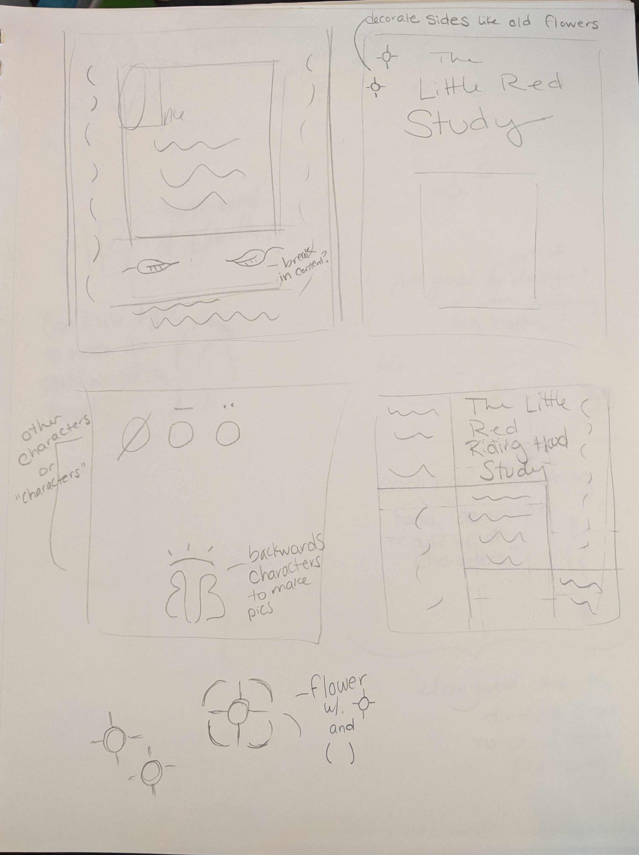
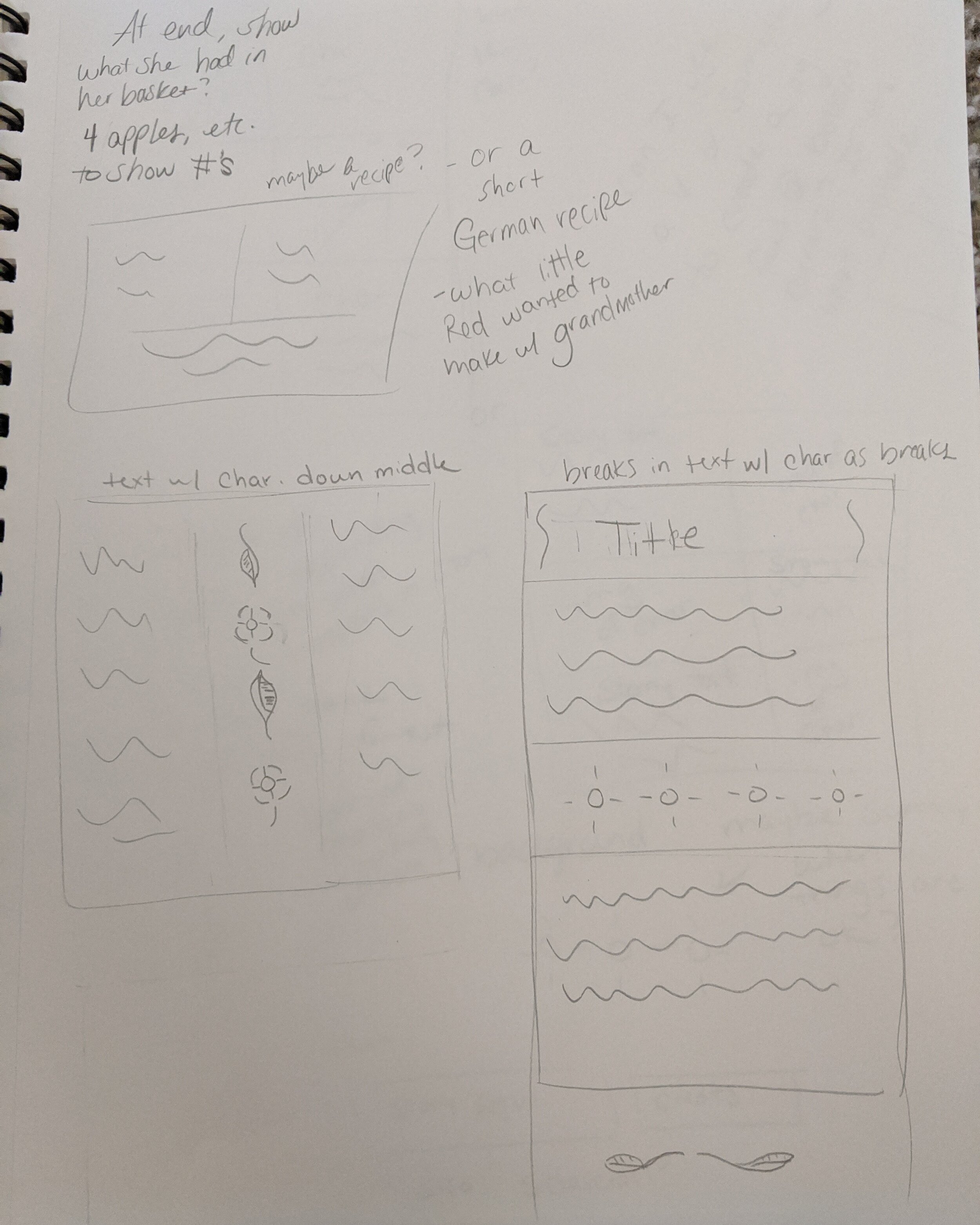
How do I keep their interest through to pricing and inspire them to use the typeface? I used different layouts to try achieve the goal of informing users while guiding their eye through the page and keeping them engaged. I envisioned users who actively seek out specific typefaces would be interested in this. While there is another type specimen for this typeface, there is not one that I found that presents the information in a story fashion.
Exploration & Process (Sketches & Moodboard)


Previous Iterations


Final Mockups


Recap
After this project, I learned different ways to guide the eye around after some experimentation and coming up with three different layouts. I would play around with the color choices and take a microscope to the layouts to fine tune anything that may not add to the design. I would like to try adding more variety to the last layout. For all of the iterations, I might focus in a bit on the “buy” button to ensure it stands out as an interactive element. Next steps include interactive portions for demonstrating type sizes or showing the difference between modern and old style figures.

