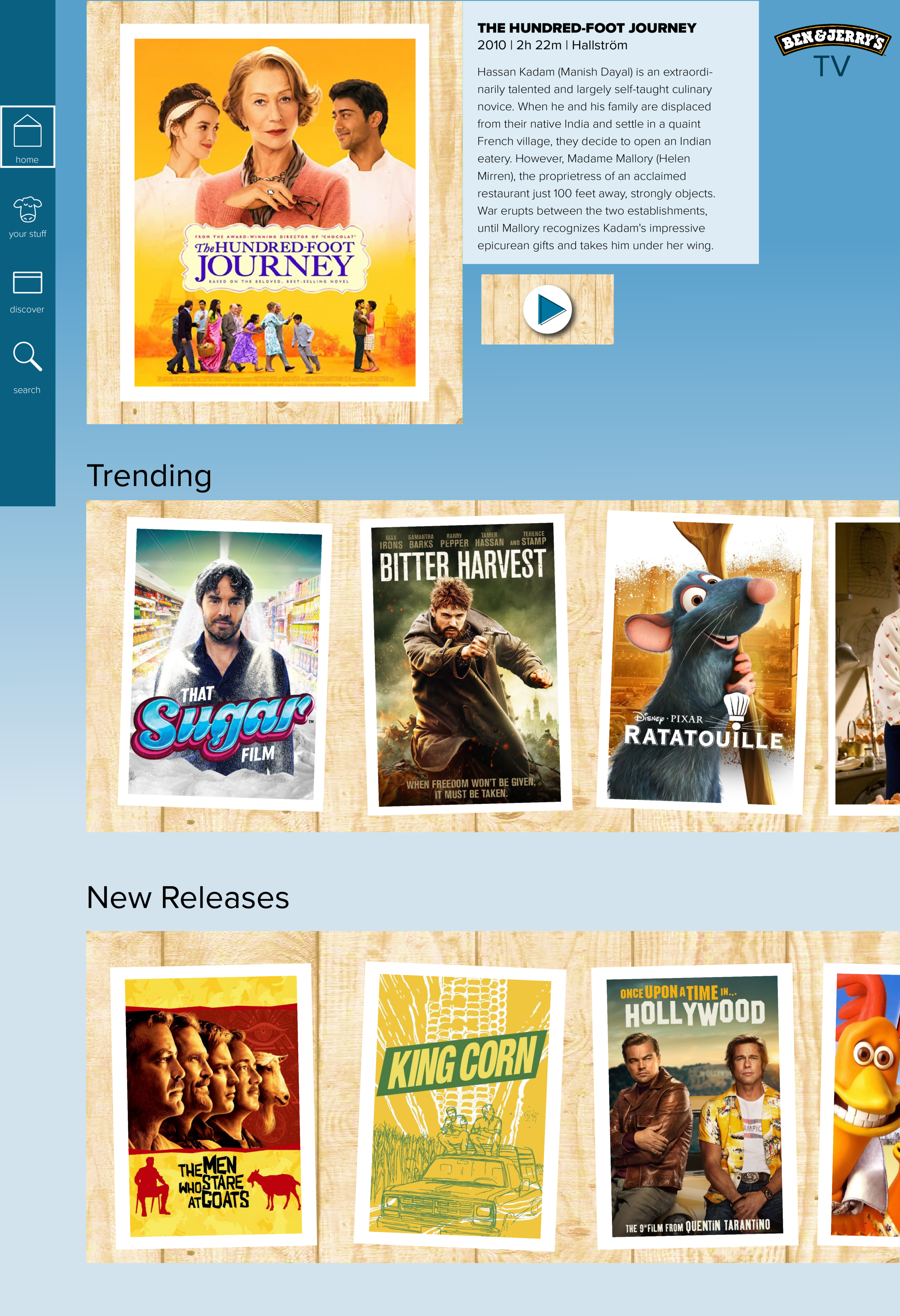
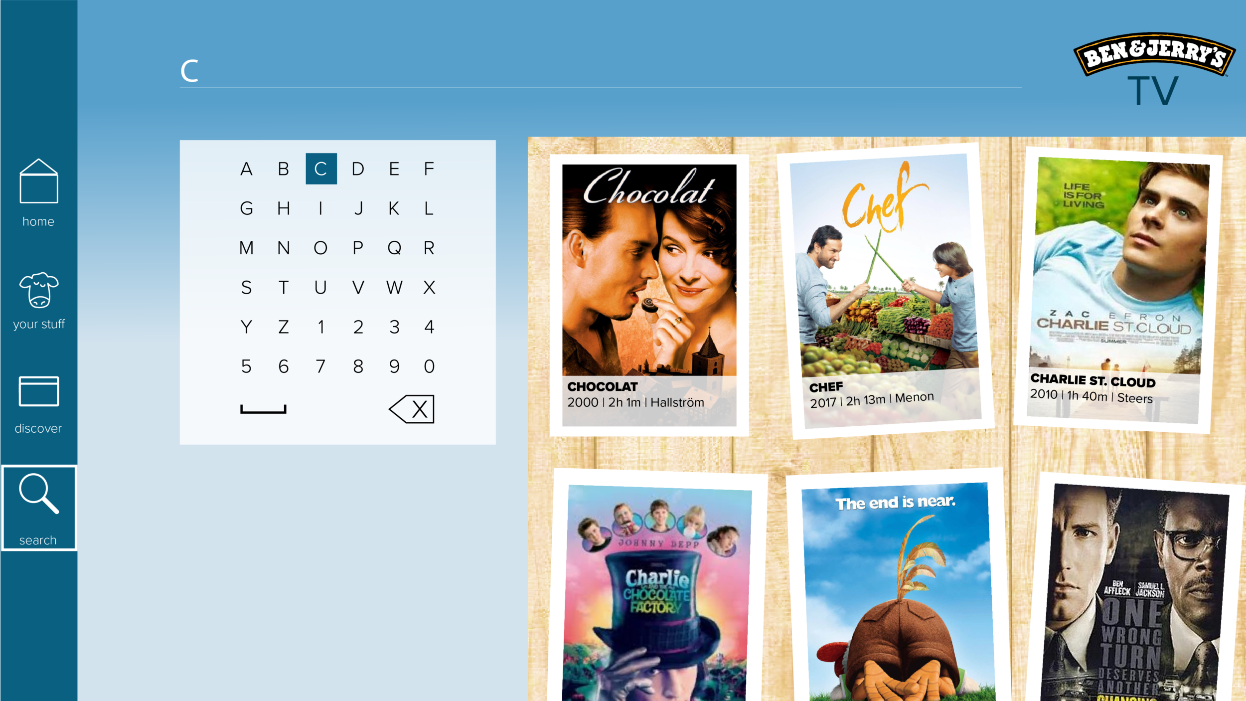
Ben & Jerry’s TV
Prototype
Created multi-platform mockups for a theoretical streaming service using an established design system.
When: July 2020
What was this for: Class project
Problem
For this project, I was attempting to solve the problem of having a curated list of viewing options for Ben & Jerry’s customers to watch while enjoying their frozen treat.
This could potentially improve the customers’ experience in ice-cream shops or maybe at home during pandemic times to help them have a fuller B&J experience sitting in the comfort of their home. In addition, especially during non-pandemic times, this could lengthen store visits and help keep customers in the stop for longer periods of time.
Discovery
&
Research
Problems I encountered included incorporating some of the components I didn’t quite have access to, in which case I would make what I could in Illustrator. Also really sifting through how components are used and any possible discrepancies in the branding guidelines was an obstacle I encountered.
Gaining a better understanding of users took some time— seemed that anyone who enjoys ice-cream, puns, and generally light-hearted atmosphere were great possible users.
As I researched other streaming services, I couldn’t find any other ice-cream, or any other streaming service where a dessert was so heavily incorporated. I had not found another restaurant that had a streaming service in addition to their already established food business.
Exploration
&
Process
For this project, I was attempting to solve the problem of having a curated list of viewing options for Ben & Jerry’s customers to watch while enjoying their frozen treat.
This could potentially improve the customers’ experience in ice-cream shops or maybe at home during pandemic times to help them have a fuller B&J experience sitting in the comfort of their home. In addition, especially during non-pandemic times, this could lengthen store visits and help keep customers in the stop for longer periods of time.
Flows
Below are a couple simple flows to show how a user might move around the page and access some functions.
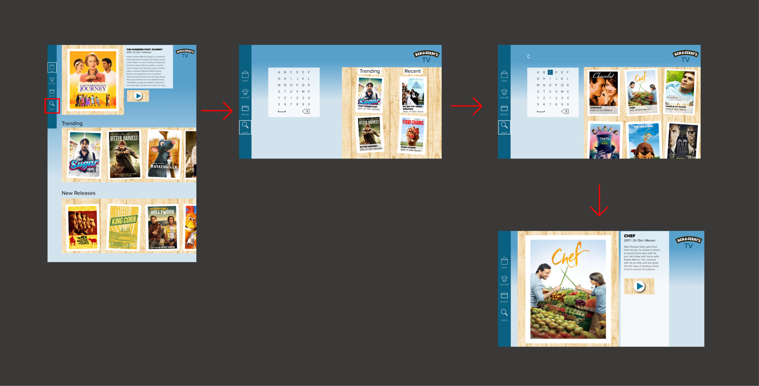
TV Flow
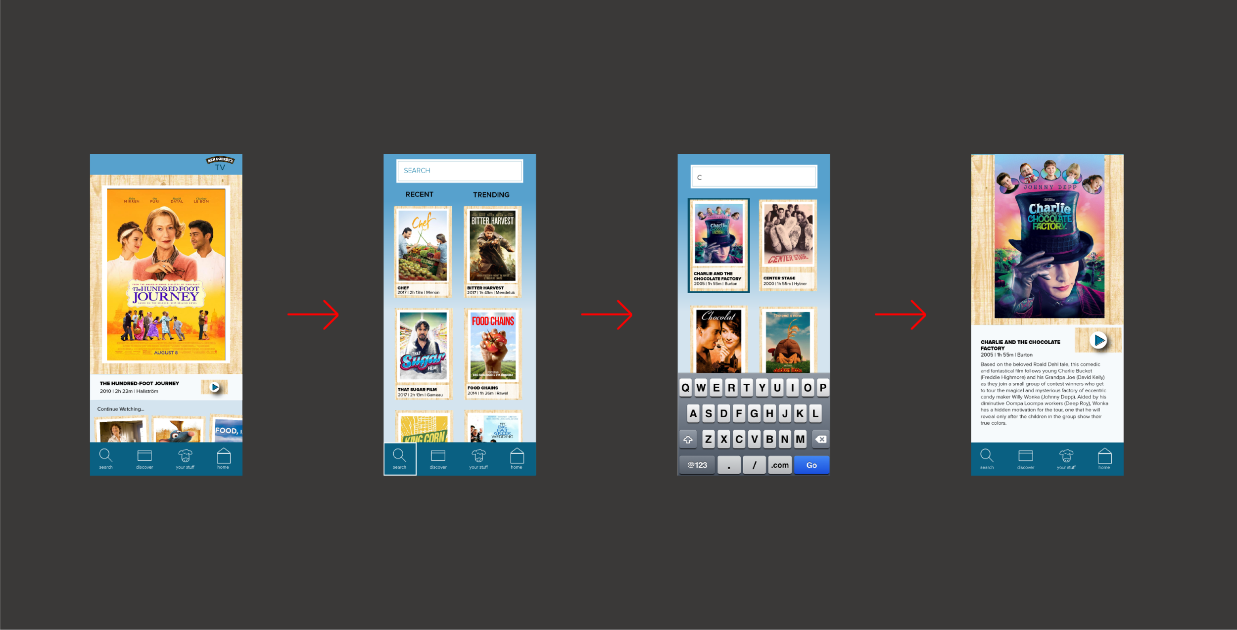
Mobile Flow
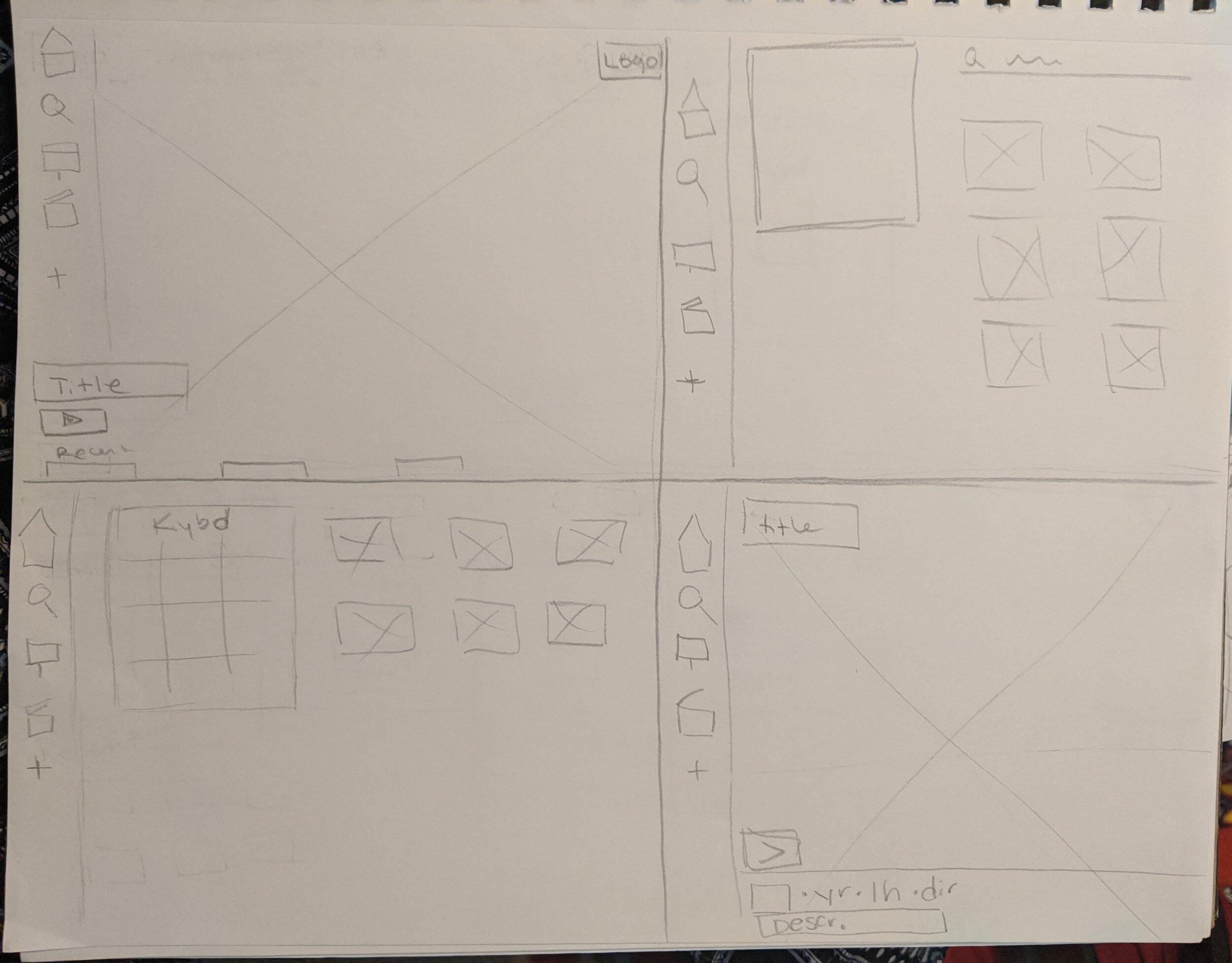
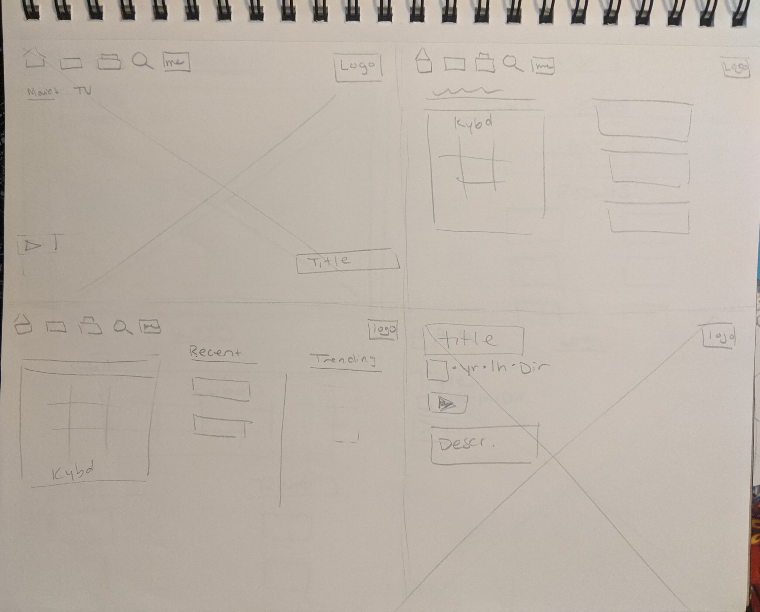
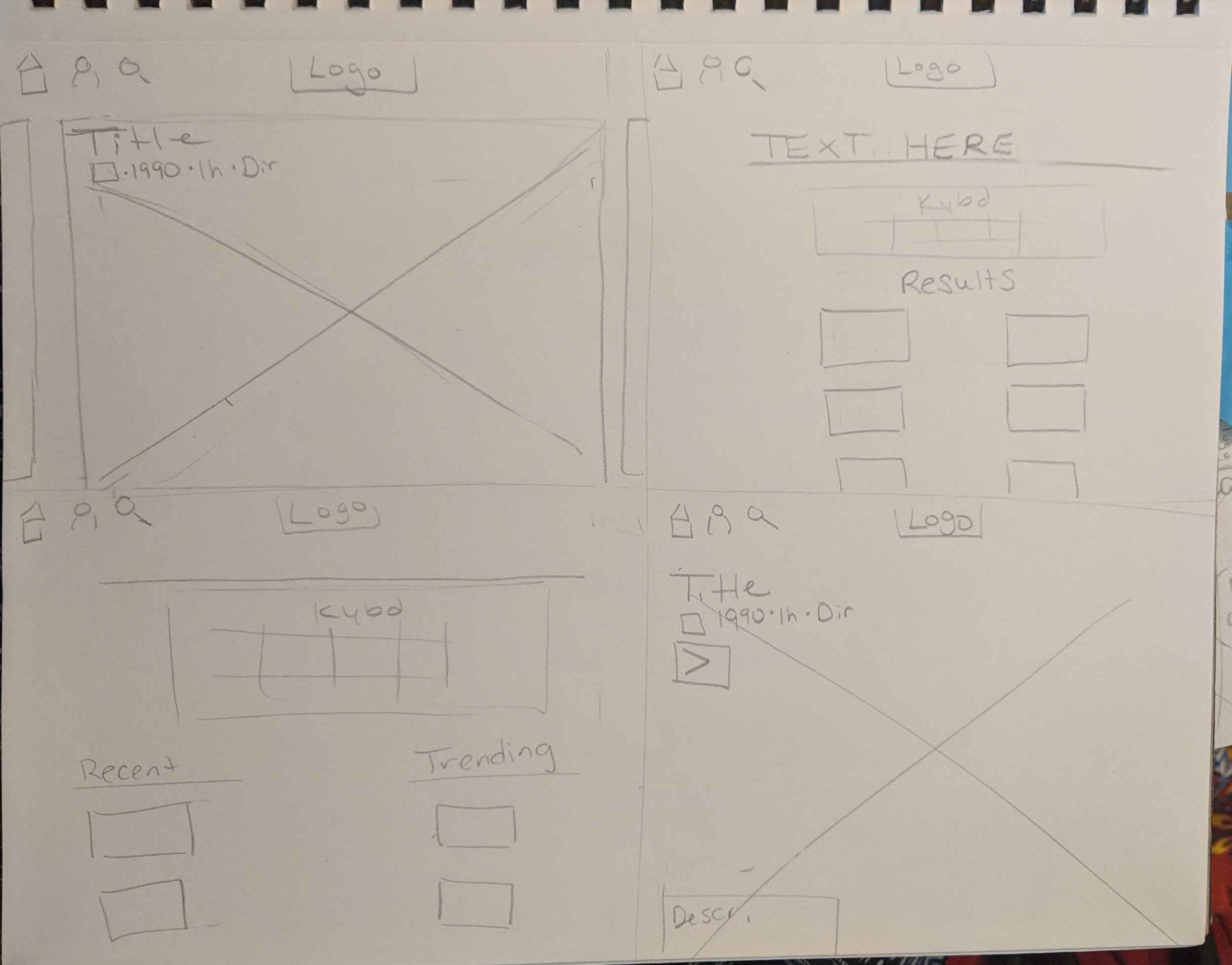
Initial Designs
(Sketches, Wireframes,
Previous Iterations)
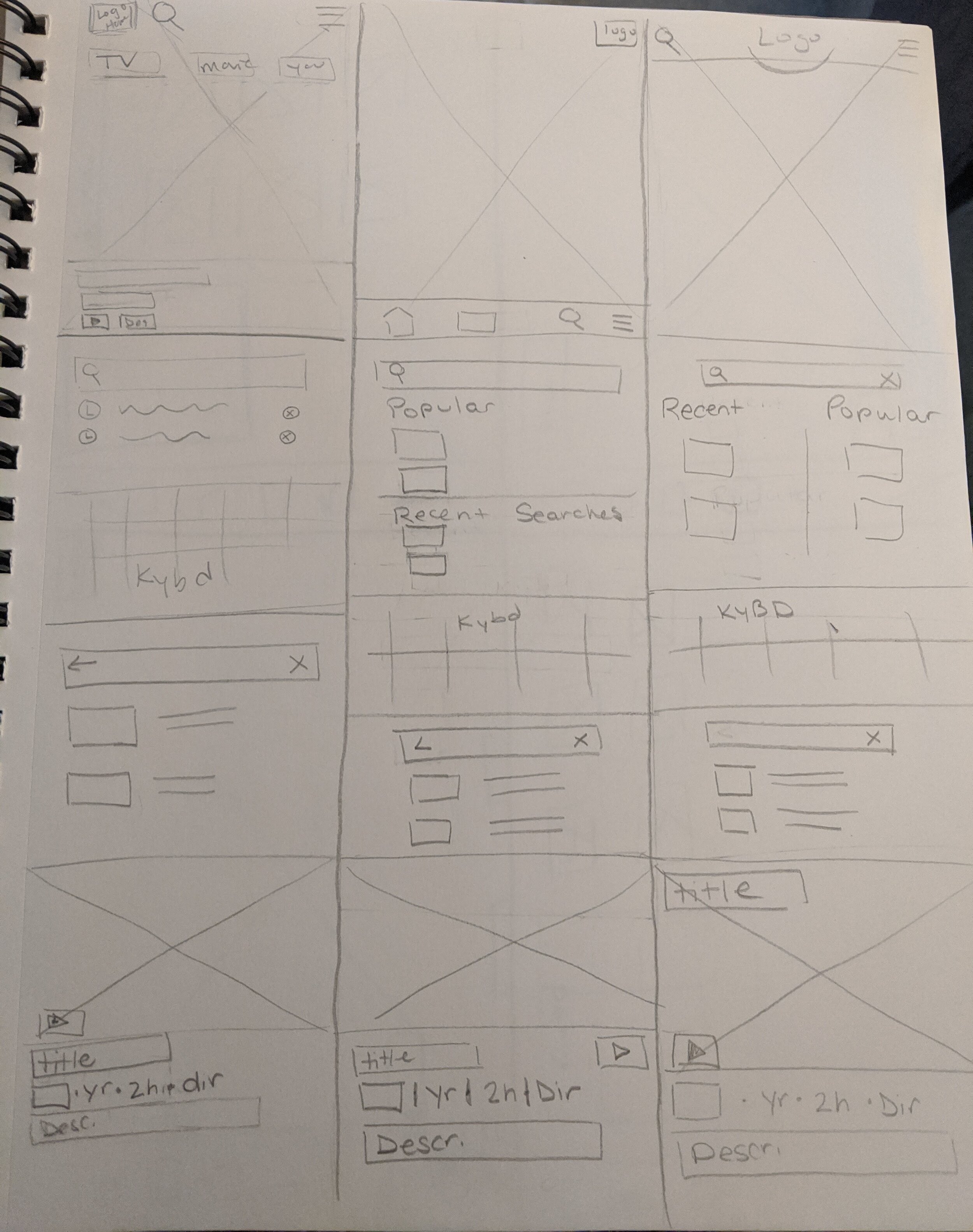

Mobile Wireframe
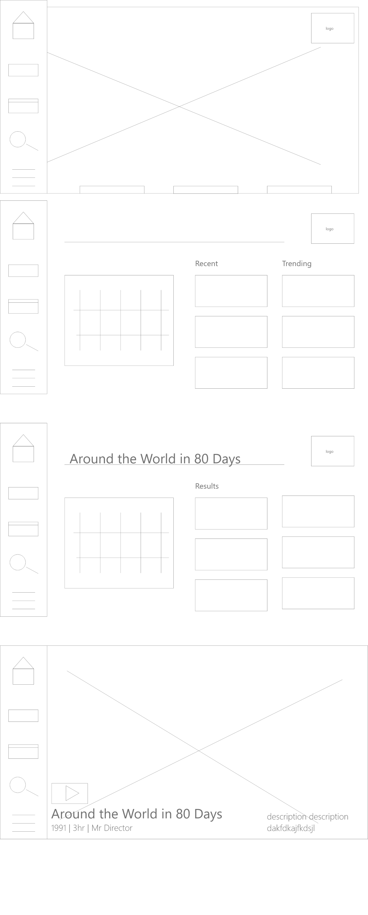
TV Wireframe
Previous Iterations
(TV & Mobile)
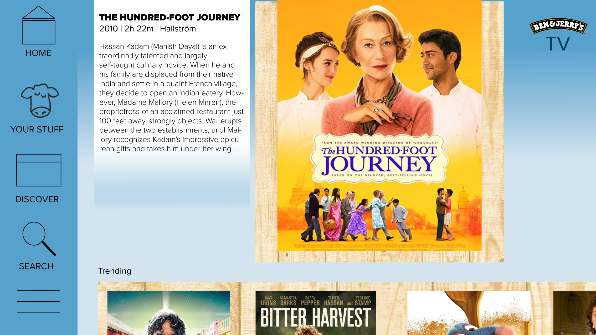
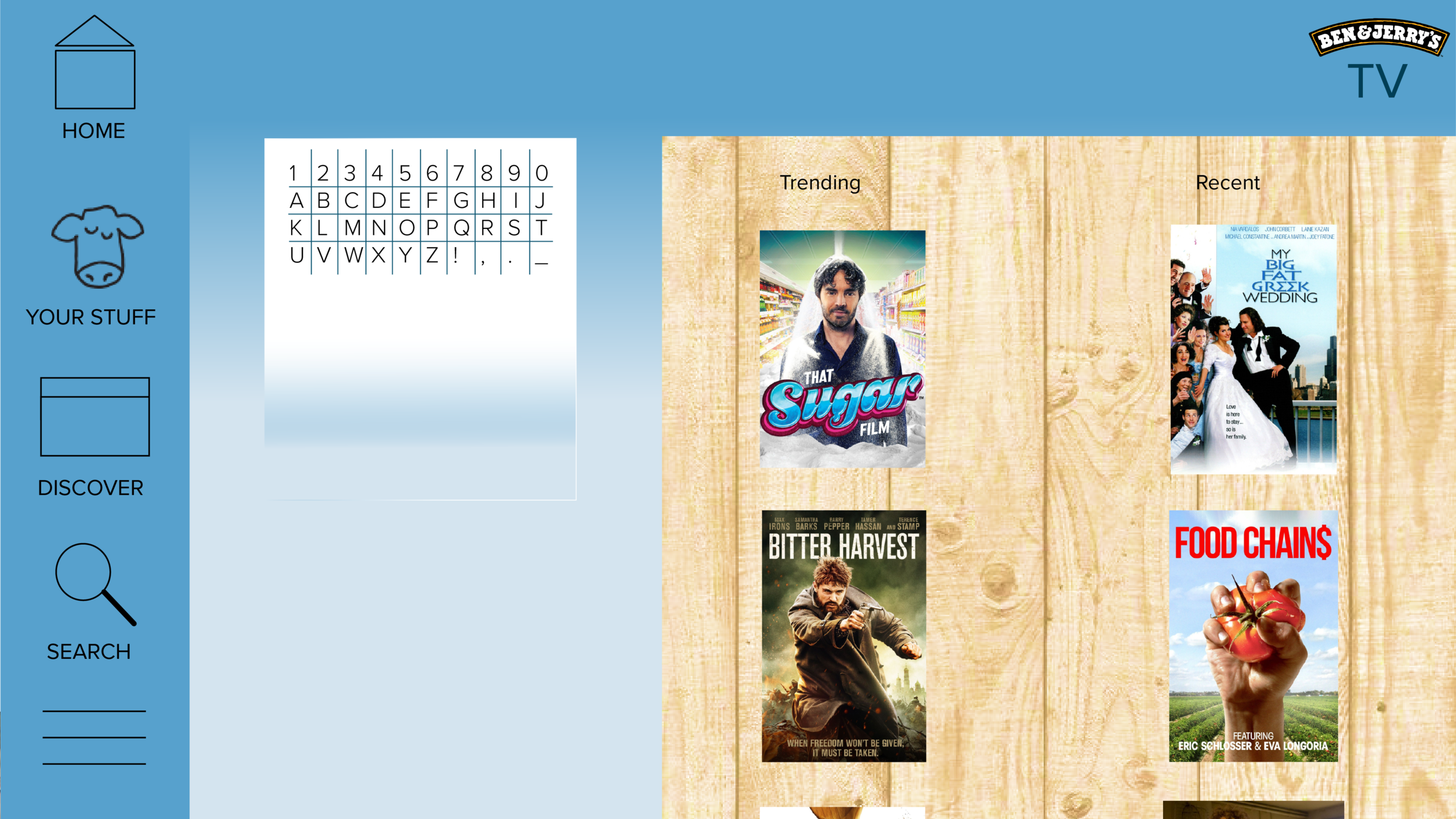
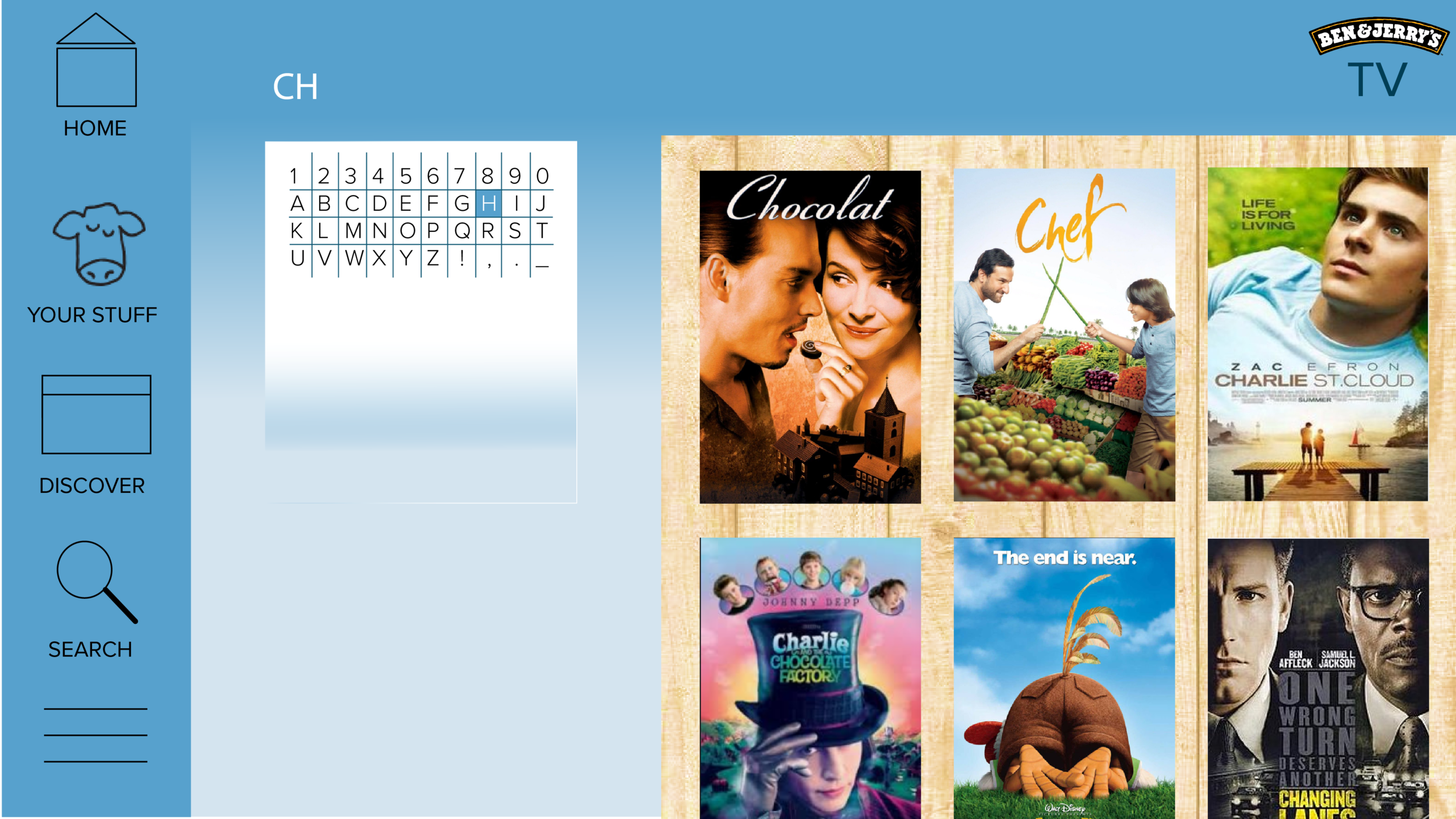
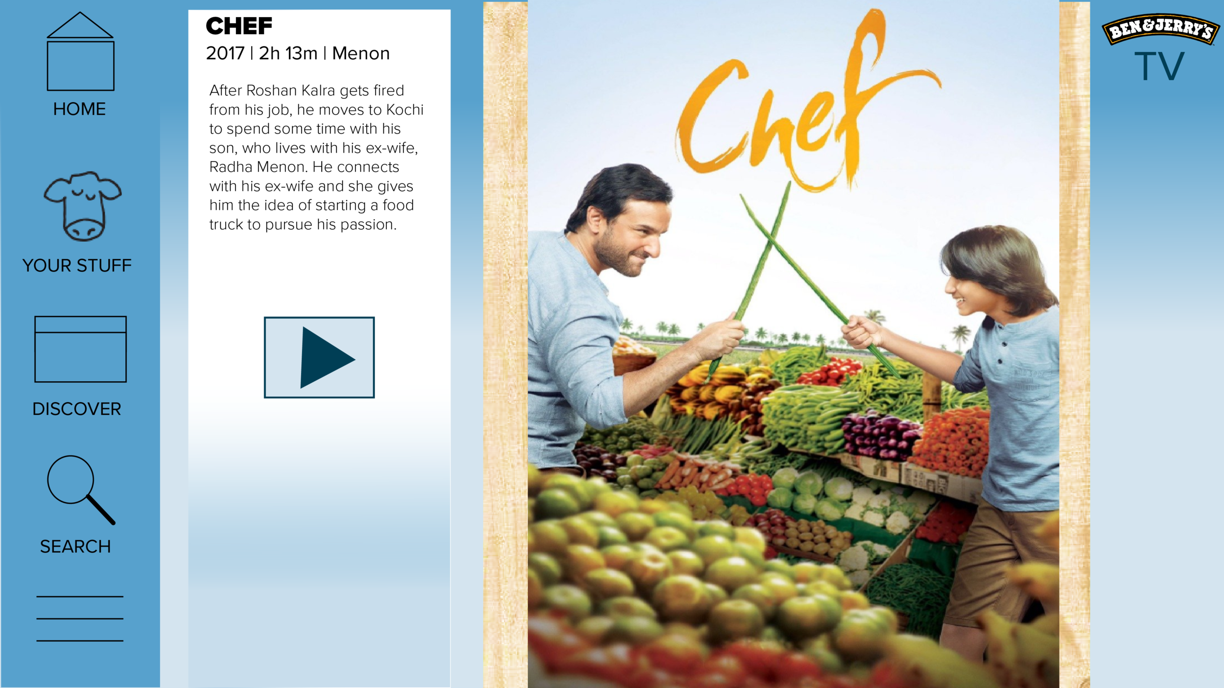
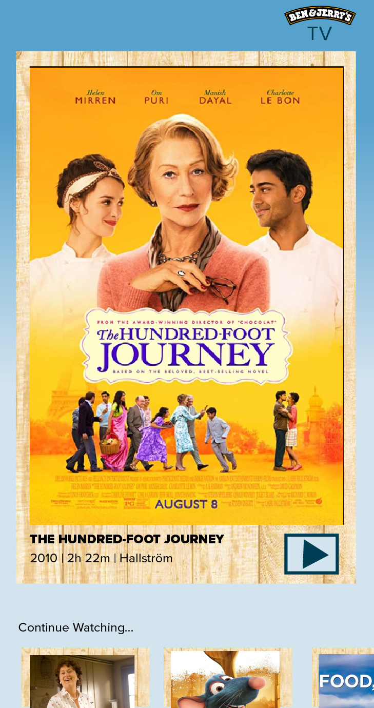
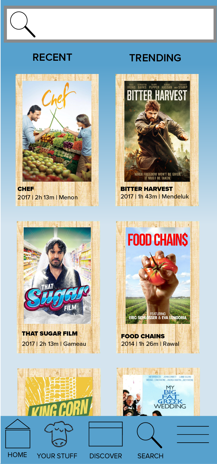
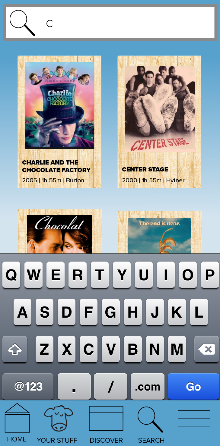
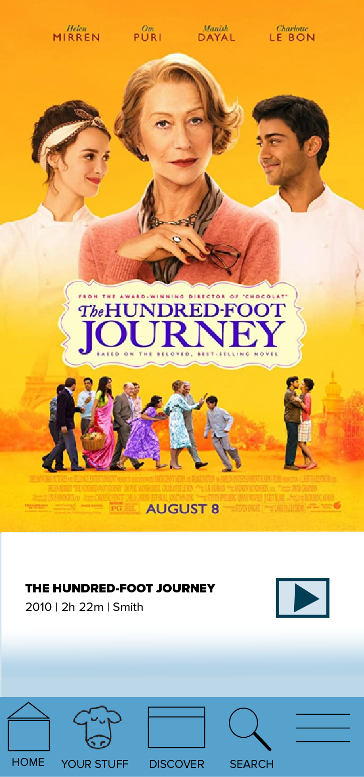
Final Mockups
Prototype Links:
TV: https://invis.io/G5YBDT73Y6K
Mobile: https://invis.io/AKYINYL3SQ9
Recap
This was my first time using inVision to prototype. In this project I also learned about scaling from mobile to TV and gaining a better understanding of appropriate sizes for the respective platforms.
Next steps for me include utilizing more of the brand’s icons and colors as well as paying closer attention to the layout specs they have in their guidelines.


